“The greatest value of a picture is when it forces us to notice what we never expected to see” – – John W. Tukey. Exploratory Data Analysis. 1977.
Data is everywhere. Data is used in sales, marketing, politics, and now more than ever education. Information helps to inform businesses and mobile apps, and helps to shape the world around you. The card you scan or number you enter at the grocery store gives the store a snapshot of your spending habits. Those things you “like” on facebook dictate the ads that you see when scrolling through your news feed. There is plenty of data floating around in the world, but only the best organizations understand how to interpret it into something meaningful.
21st education understands that data collection is important, but I believe that interpreting is still in its infancy. School districts cannot afford statisticians and often we are left with spreadsheets of data that tie only numbers to students. Ugh, spreadsheets. What – a – headache. Way too much time is spent figuring out what number goes with what student or whether that number means growth, mean score, percentile, or whatever. Either way you put it, interpreting the data is HARD.
What is the point of data in schools?
1. Large amounts of collected data should help see pockets of strengths and weakness in a building to make celebrations and next steps more clear.
When a company finds that some employees are thriving and others are struggling two questions arise. What makes the thriving members so great, and what support do the struggling members need? Without proper visual displays of data, it becomes difficult to determine the thriving members as well as those in need of support. This is a problem and impedes potential progress for schools.
2. Smaller, more individualized data, should help paint a detailed picture of each student.
Between the MAP, ACT, and ASPIRE kids are absolutely tested out. Throw in literacy assessments, math tests, and every other academic grade students receive I sometimes wonder the actual ratio of learning to assessing. Every student deserves their information to be collected and visually organized in a matter that can help them and others make meaningful connections about their learning.
Possible Solutions
While attending ISTE 2015 I sat in on a session led by Sujoy Chaudhuri and Shabbi Luthra. Their approach to data was interesting. Instead of looking at MAP scores through a spreadsheet, they created visual displays that broke the scores into smaller strands and organized students visually depending on their strength or weakness within a set of skills.
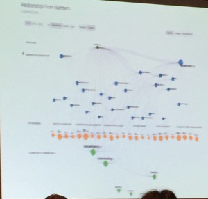
Instead of deciding which teaching standards needed to be emphasized and hoping it would work out, they tracked and compared artifacts as they related to ISTE standards, state teaching standards, and Marzano’s effective teaching strategies. They were able to visually see areas of weakness, emphasize the work, and within a year a visual improvement was noticed. It is amazing stuff when the data is presented so clearly.
Things to Consider
Regardless of the data collected it is up to you to determine what patterns are important. As said by Blaise Pascal, “We are more easily persuaded by the reasons we ourselves discover than by those which are given to us by others.” We were left with these guidelines when interpreting data:
Wonderings – What do you find yourself wondering about as you look through the data? Wonder, discuss, uncover but don’t jump to conclusions
Observations – Look for patterns. What are you seeing? What are the outliers? What are the surprises?
Connections – Start to connect the data with your background experiences with a student, a class, a grade level, a school, a curriculum, other variables and other data
Questions – What are the questions you find you need to think about, talk about, act upon?
Whether you are a teacher or administrator it is important to find ways to produce and interpret visual representations of data rather than spreadsheets and lists. Too often we find what want to see in spreadsheets and use data to justify our own rationale. We now educate in the day and age where data rules. It is time we find an effective way to use it and help propel us forward. If we don’t, I’m afraid we will continue to spin our gears and not find meaningful progress.
If your school or district uses data in an interesting and meaningful way will you please share?